PAVEMENT PRINT STUDIO /
Internship + In-House Designer
Mobile Printmaking Project
MAY-JULY 2024 + MARCH-MAY 2025
INSTALL 01 /
Designer,
Screen Printer,
Facilitator.
ABOUT PPS:
Pavement Print Studio is a student-led mobile printmaking project from RMIT Graphic Design Brunswick. Established in 2025, working with multiple screen printing techniques, creating accessible collaborative experiences in public spaces.
INTRODUCTION:
The idea was there, the grant was in, and the festival was coming up. Unfortunately it was coming up in.. 2 weeks.
DELEGATION & DIRECTION:
Starting from absolute scratch, Simon gathered the rest of the team, and we began working together to practise and plan for our first event.
As an early participant in the team, I was tasked with the branding and web design.
Simon had asked that the logo represent some sort of movement, emphasising the mobile aspect of the brand.
Although Simon had recommended I use some existing lettering of mine that captured these themes of navigation and movement, upon my first trials it was deemed unsuccessful. I decided to jump into a new ideation opposed to recycling past ideas.
CONCEPT:
The first step was researching print iconography.
This involved preflight icons, physical print symbols such as crop and / or registration marks, and other industrial shapes and symbols.
Using these markings as inspiration I put together some different formations of crop marks, met with the most logical symbol for movement that I could think of - an arrow. But this was more than just symbolism. As Simon had first recommended lettering, I wanted to maintain this theme of subtle initials, and created a ‘P’ formation using the print marks as the closed counter and the arrow as the stem. I then slanted the icon on a 45 degree angle to avoid a downward arrow (felt negative) as well as to create a deeper sense of forward movement. I paired this icon with some industrial looking mono-type, to continue leaning into the technical vibe, as well as a CMYK inspired colour palette, solidifying it’s reference in print.
FEEDBACK & REFINEMENT:
I then utilised our first group meeting / print session as a chance to gather some feedback. It was decided the Logo needed a thinner stroke, and there was some kerning needed on the word-mark. Apart from that the look was agreed upon.
I made these adjustments and the suite was confirmed.
KEY ROLE: VISUAL IDENTITY - As an early assistant of Simon Rankin’s Pavement Print Studio founding, the first role I undertook was completing our Visual Identity & Brand Application.
APPLICATION:
Now that the Visual Identity was built, it was time to use my Style Guide to create some Workshop & Exhibition Collateral, as well as begin to establish ourselves as a brand, with a website and instagram.
First I put together a single scrolling page design, using the freshly made branding suite, as well as some existing photography. This included About us, Sponsors, Values, and more.
I then created an A-frame of our sponsors, to be set up at our workshops, as well as an Exhibition Decal describing our installation, with a full roll call of our team.
FESTIVAL PREP:
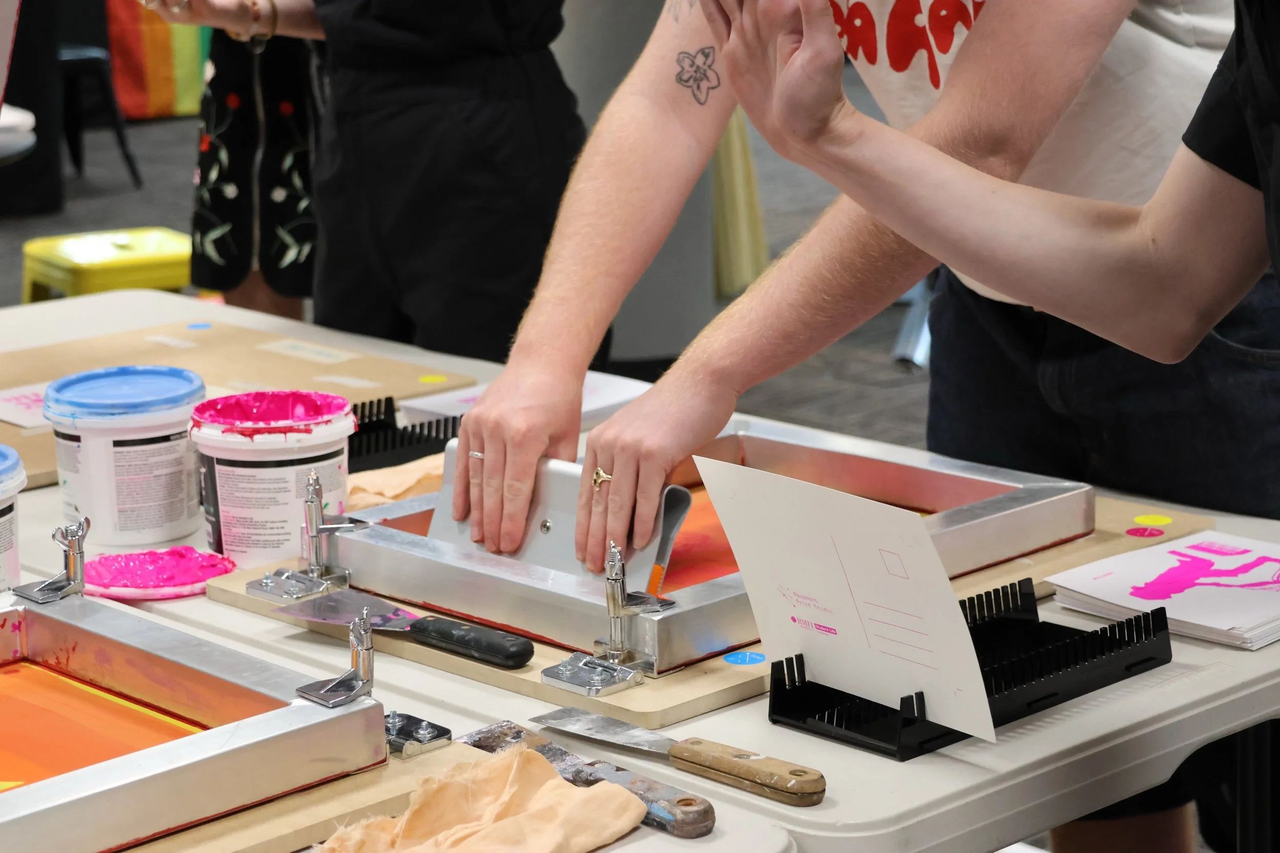
Considering I had done no prior Screen-Printing, Learning how to use the HANDERUDE Plate Making machine, and the SURIMACCA Modular Screen system, was quite the feat. Not to mention learning the general technique of making effective passes with a squeegee and ink on paper.
As a team, we mastered an efficient work-flow with this system of printing, enough so to be able to successfully demonstrate & instruct participants in their own printing.
We also helped bump in, which included the application of some branding in stickers and signage, as well as our decal and exhibition wall. We then organised our stations, and conducted some test runs.
WORKSHOPS:
2 Days of workshops. These days went well, with insanely more people coming through than ever anticipated. We had to start floating around, speaking to viewers about who we are and what the exhibition is about, whilst teaching and supervising participants printing. We also had to station people on the printing of screens, and set up of frames.
Although we got busier than expected, these sessions ran smoothly and successfully, with zero incidents or dramas, and many many happy customers.
OUTCOME:
Overall this was a very exciting project that I was honoured to be involved in. I learnt how to screen-print from no experience, to a now confident and informed printmaker, I learnt how to incorporate brand architecture, with the use of our sponsors logos throughout the event’s design roll out, and I learnt how to professionally and efficiently work with a large group of both team members and participants, in a highly time sensitive design environment.
Scroll For Part 02 MAY - JULY 2024
INSTALL 02 /
Socials, Videography,
Screen Printing,
Exhibition Design.
LESS UNREASONABLE - The Transmedia Relay, initiated by Aimless Research Institute, positions creative work as a chain of response. Diagrams became Sound, became Prints.
INTRO:
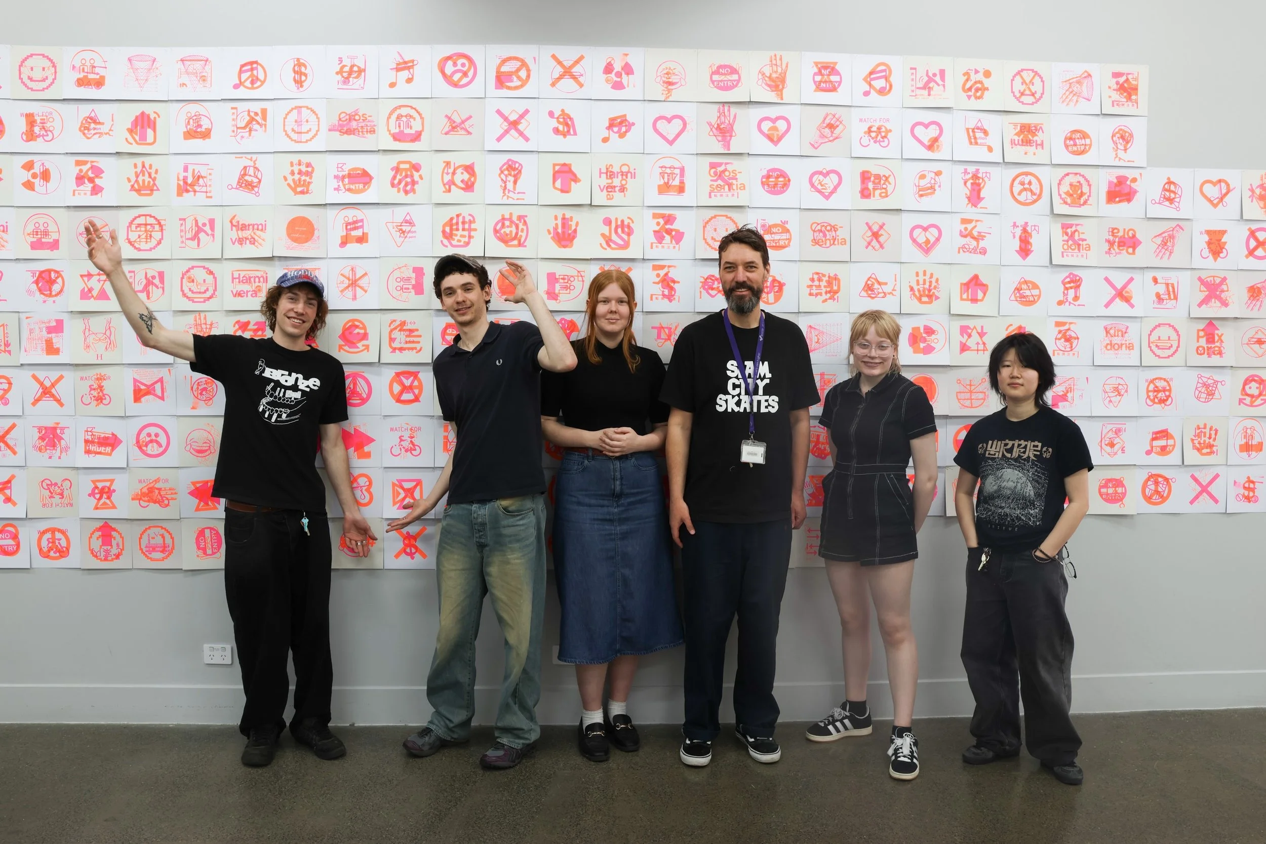
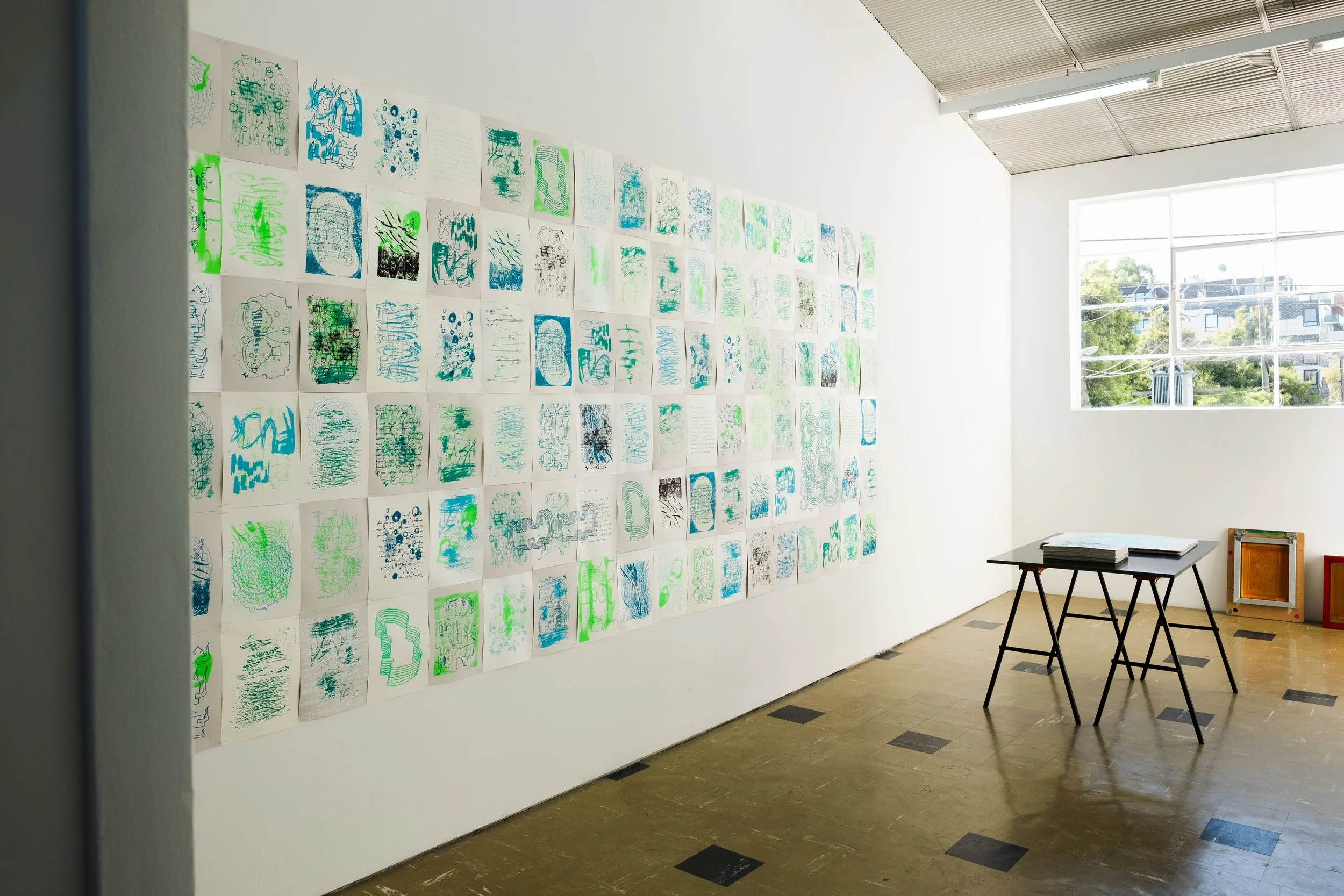
Less Unreasonable is representation of the moment when sonic performance becomes screen-printed visual language. KLATSCH Ensemble's six-hour performance Object Lore happened in this same space. Our response emerged from that encounter. 22 exposed screens, layered prints in forest greens and midnight blues.
DIRECTION:
This
PROCESS:
First
OUTCOME:
Overall,
MARCH - MAY 2025
INSTALL 03 /
Art Directer,
Exhibition Designer,
Facilitator.
INTRO:
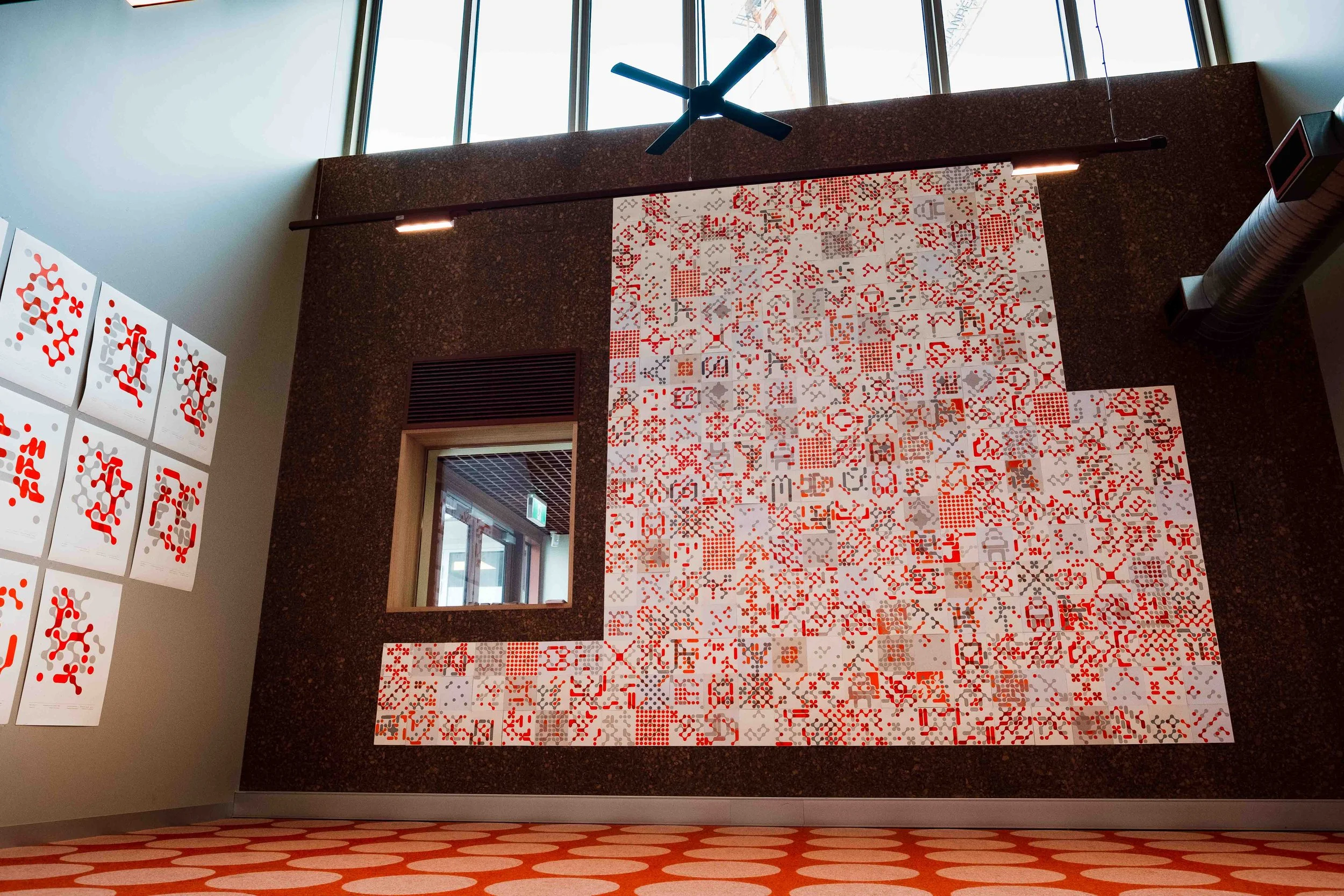
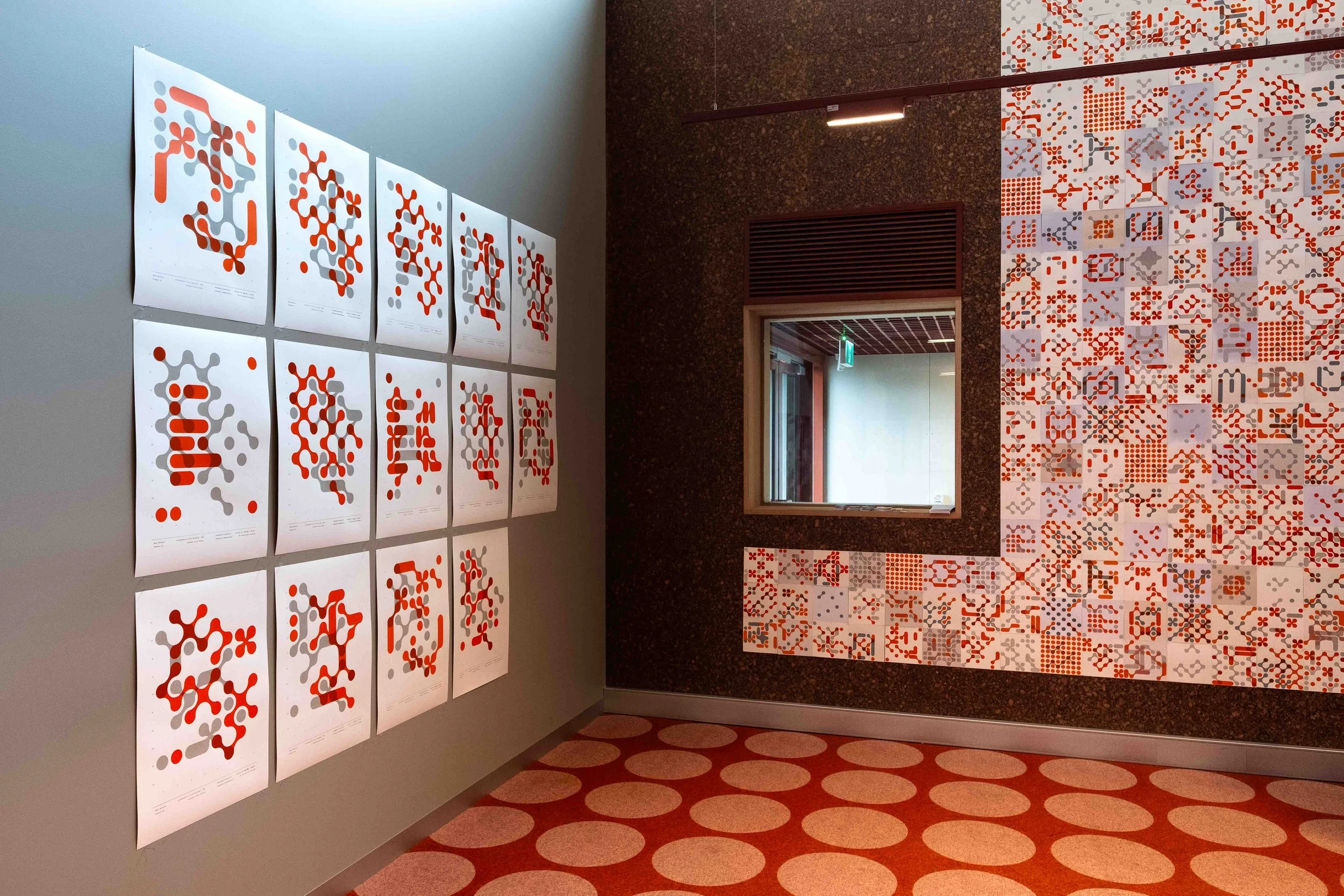
Open Edition invited members of the public to become contributors to a collaborative screen printing activation and exhibition during Melbourne Design Week 2026 and Brunswick Design District 'Design Behind Closed Doors’.
Over four days we ran eight workshops with eighty participants, creating 631 two colour collaborative prints that became a large-scale installation at Balam Balam Place in Brunswick.
DIRECTION:
When
PROCESS:
To
MELBOURNE DESIGN WEEK 2026 - 80 participants created 631 collaborative screen prints across 8 workshops, culminating in a large-scale exhibition at Balam Balam Place.
OUTCOME:
The network motifs reflected actual networks created through the project. Networks between workshop participants who met while printing. Networks between participants and crew members facilitating sessions. Networks between the studio and institutional supporters making the programme possible. Networks between Melbourne Design Week, Brunswick Design District, and the RMIT Brunswick graphic design community.
Scroll For Part 02 MAY - JULY 2024